In the weeks since our previous post, we’ve seen development in the security community with
the release of an exploit into a commercial product as well as the announcement of the
unreleased integration of an exploit into Rapid7’s Metasploit framework. During this time, we
wanted to provide an update of affected machines, but also dive a bit deeper into the
characteristics of the individual systems that remain exposed and unpatched.
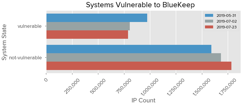
As of July 23, 2019, approximately 788,214 systems remain vulnerable, a decrease of almost 20,000 systems from July 2nd, which is a much smaller decrease than what we observed between May 31 and July 2, even when factoring in that the period between these observations is 33 days compared to the 21 days of the latest observation. Previously, the average of remediated systems between the two observations were approximately 5,244 systems per day. In the comparison between July 2 and July 23, we’ve observed a simple average decrease of approximately 831 systems per day. As such, about 81% of the exposed vulnerable systems observed on May 31 remain unpatched.
 Unfortunately, we might encounter a situation where the rate of patching tapers off leaving
behind a legacy set of systems that remain vulnerable, perhaps unbeknownst to system
operators. A year and a half after the WannaCry attacks, there still remain systems vulnerable
to EternalBlue, and close to 11 years after Conficker was released, there are still close to
500,000 machines infected.
Industry Response
The following chart shows the percent of companies within each industry that still have a
vulnerable system exposed on their network perimeter.
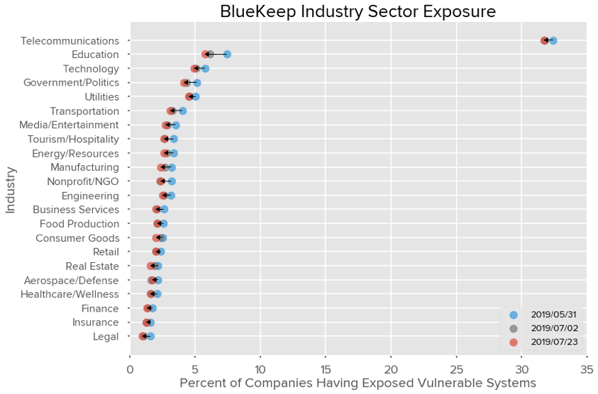 Likewise, we’ve seen slower movement in the number of organizations with BlueKeep publicly
exposed. Real Estate, Consumer Goods, and Manufacturing have shown the largest relative
decrease (16.4%, 14.6%, 10.9% decrease, respectively) since July 2. Utilities are now the
second most affected industry (at 4.53% exposure) after Technology (at 4.94% exposure) if
Telecommunications and Education are excluded.
Geographic Changes
The following chart shows the geographic changes since our previous measurement. The x-axis
is the number of systems with BlueKeep publicly exposed on May 31, which is also represented
as the horizontal line in the middle of the chart. The y-axis measures the fraction of systems
remediated against the vulnerability relative to the country’s value on May 31st. If all exposed
vulnerable systems within a country were remediated then that country’s y-axis value would be -
1.
A blue line between measurements denotes that an improvement was made between the
observations on July 2 and July 23. A red line means a regression has occurred from the last
observation.
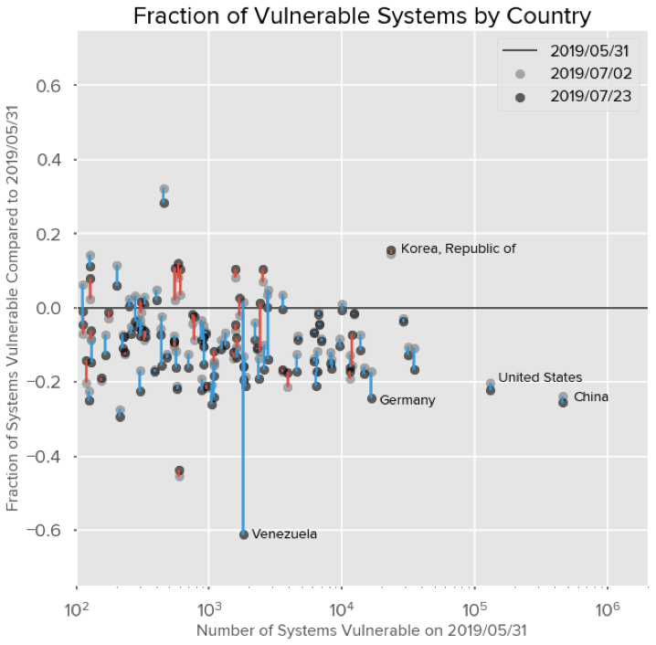
For example, about 20.2% of US-based systems were remediated on July 2 compared to May
31 and this has since increased to 22.2% as observed on July 23. For countries with over
10,000 exposed vulnerable systems on May 31, China has seen the greatest improvement with
a reduction of 25.6% as of July 23. Germany follows at a reduction of 24.3% systems with the
US afterwards.
Most countries saw an improvement in reducing the number of exposed systems that are
vulnerable, with fewer countries regressing. Minor variability is to be expected as the remote
accessibility of systems might not be guaranteed or reliable between observations.
Characteristics of Affected Systems
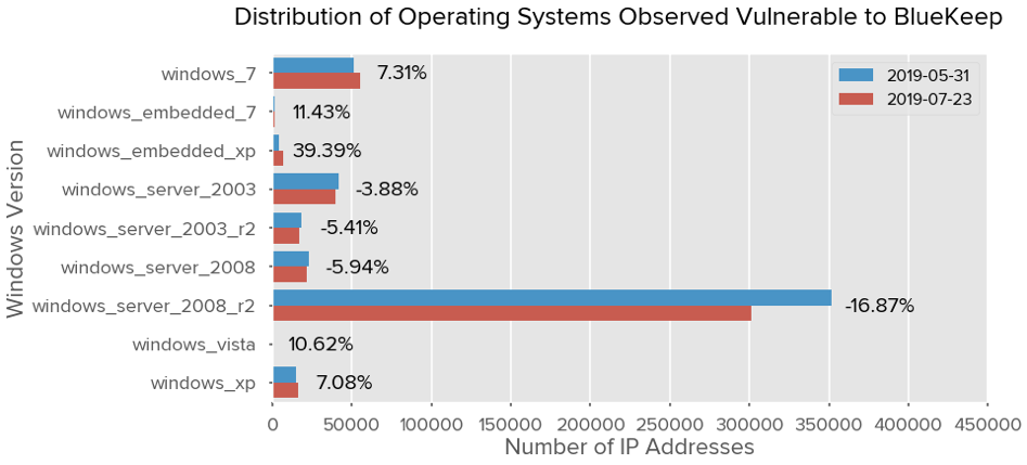
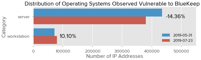
Beyond assessing how the number of exposed vulnerable systems have changed over time, we
wanted to begin to explore the characteristics of these systems and how those have also
changed since we have started observations. In this first endeavor, we decided to investigate
the operating system families and editions of the vulnerable systems that remain externally
exposed.
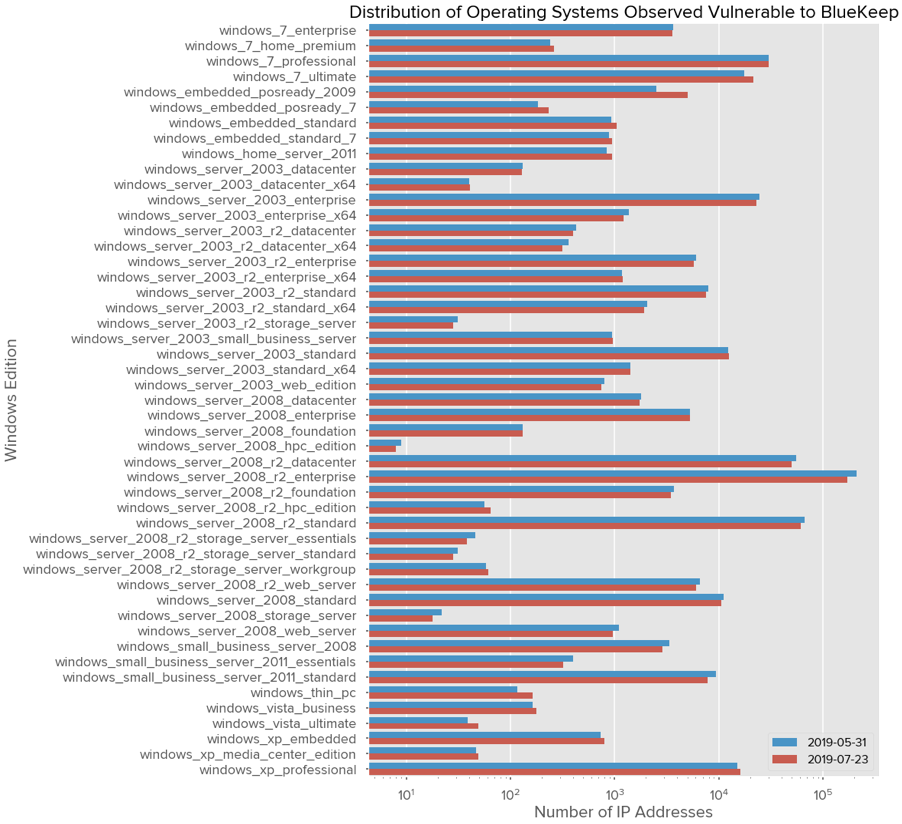 Note that unlike the previous charts, the x-axis is logarithmic, allowing better readability for