
As the Bitsight front end team grows we are investing in our design infrastructure to enable faster development, better collaboration, and a more unified look and feel in our product.
Part of the strategy for building a better user interface is the implementation of a design system - an organized and documented set of components that can be reused across our products. Setting up this system required a lot of research and a lot of work invested in laying the foundations. Creating these components has let us create a more unified UI by predefining the correct usage of elements. We can also create pages and views faster and with less code complexity because the styling and behavior of components is already implemented.
In this post I’m going to show how we developed our design system, how developers use it, and what’s next.
Branding and Color
Our first major effort was defining the basics: colors, fonts, and logo treatment. Defining the official colors and fonts helped to clean up minor differences between pages and make it very easy to decide which color to use for an element. The most important detail was the definitions for text, border, and background colors. Before we had these guidelines developers and designers would choose hex codes based on how light or dark they felt like an element should be, leading to a “50 shades of gray” problem. We also wrote simple guidelines on when to use different shades for information hierarchy, adding context and meaning to our color choices.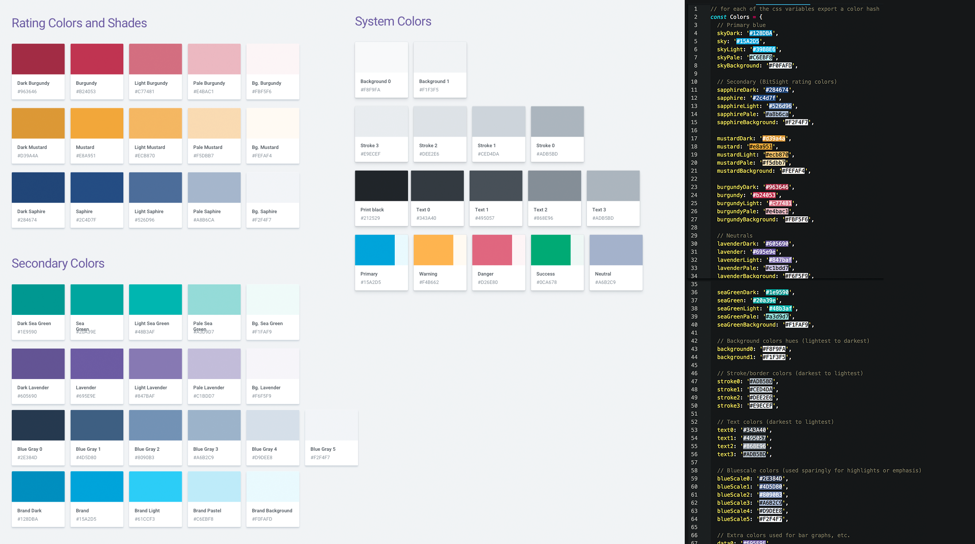
Color swatches and code definition
For UI development, we created a single JavaScript file that contains all valid color definitions. We use Webpack to read this file and automatically make all of the colors available as variables in CSS files. Finally we added a linting rule that throws an error if anyone uses a hex code instead of one of these variables, which enforces consistency and ensures that all the colors are defined in only one place.
Reusable Components
The concept is nothing new — creating a branded set of predefined elements that are fast and easy to implement. At Bitsight we audited several existing component sets and identified the need to create our own set of components. This allows us to develop a unified look and optimize interactive elements to fit our needs and use cases.
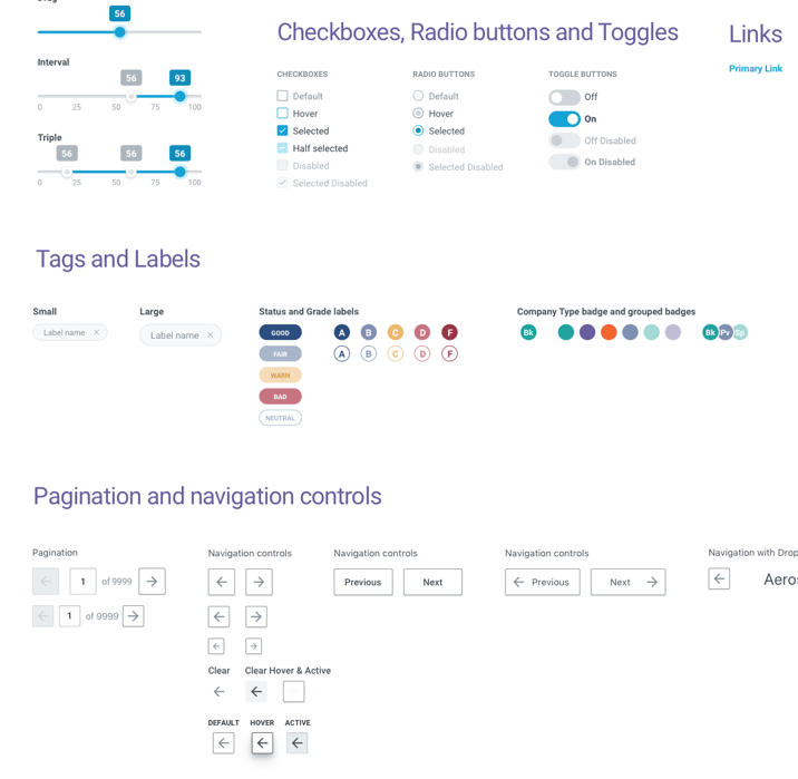
Some of our reusable components
We created all of these using React and publishing them to a private package repository. This allows our components to be tested and developed independently. We are able to manage updates using version numbers. Developing these components independently has several major advantages. Implementing one in a page is very fast and easy, and the component’s functions do not need additional testing. If there’s a bug in a component, we can fix it in one place, bump the version, and the bug will be fixed for every use case.
The Design System
The reusable components are very useful tools for building user interfaces, but as our team expanded we were having more and more problems with enforcing standard usage and keeping developers and designers synced up with what tools are available. The solution was to implement an online design system. We chose to use Storybook JS, a popular documentation system for user interface elements.
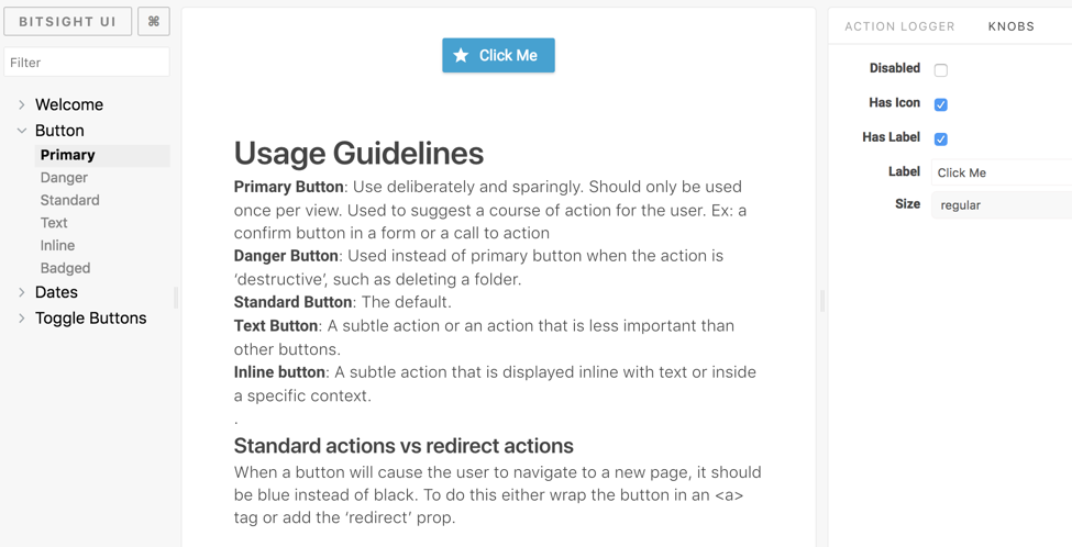
The first release of our design system.
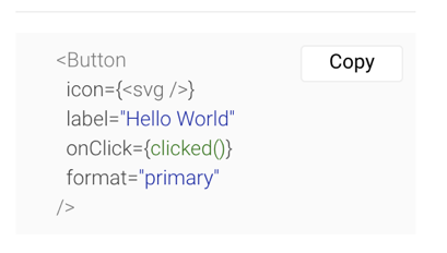
The key feature of this system is the ability to add easy to read usage guidelines for each element. We also have the ability to experiment with the different component properties and variants. Sample implementation code is automatically generated — a handy shortcut.
More importantly, our design system serves as a “source of truth” for the user interface elements and is used by both our front end developers as well as UX designers to refer to the correct way to use components. This helps prevent misuse of elements and enforce consistency between different pages.
The online design system is automatically kept up to date whenever changes are published.
What’s Next
For now we are continuing to document and develop reusable components in the design system. The more content we have, the more useful it will be. The design system is not publicly available online yet, but could be released in the future. Having this documentation in place will support our goal to continually improve our product’s UI as we grow, and we are always looking for ways to make design and development faster and easier.